Wikipedia:Featured picture candidates/June-2008
From Wikipedia, the free encyclopedia
| Featured Picture Tools |
|---|
Please cut and paste new entries to the bottom of this page, creating a new monthly archive (by closing date) when necessary.
- For promoted entries, add {{FPCresult|Promoted|Image:FILENAME.JPG}} to the bottom of the entry, replacing FILENAME.JPG with the file that was promoted.
- For entries not promoted, add {{FPCresult|Not promoted| }} to the bottom of the entry.
- Do NOT put any other information inside the template. It should be copied and pasted exactly, and only the first one should have FILENAME.JPG replaced with the actual filename.
| Older Archive | |
| 2004: | January - February - March - April - May - June - July - August - September - October - November - December |
| 2005: | January - February - March - April - May - June - July - August - September - October - November - December |
| 2006: | January - February - March - April - May - June - July - August - September - October - November - December |
| 2007: | January - February - March - April - May - June - July - August - September - October - November - December |
| 2008: | January - February - March - April - May - June - July - August - September - October - November - December |
| Purge page cache if nominations haven't updated. | |
[edit] Valued image seal

- Reason
- It is the logo for a new review system that emphasizes the images that are available in the commons collection and selects the superior image for conveying the information it is supposed to convey. For me, I thought I knew about the subject that the image I had given favorable support to in another review system but while checking the requirements of this new review system, I realized how little I knew about the subject and looking at the other images available was a very good exercise. As English wikipedia is today rerunning one of their featured pictures, let me use the example of a spoon. An image of a spoon might not have enough whatever for the other review systems but if that image of a spoon is the best one that is available to represent the idea of a spoon, then it should become the Valuable Image and get this seal. Handcrafted by LadyofHats and/or LadyofHats for use at the new review system.
- Articles this image appears in
- none yet, sorry
- Creator
- LadyofHats
- Support as nominator --carol (talk) 03:03, 1 June 2008 (UTC)
- Oppose It's not in any articles, hence it doesn't meet the criteria of adding to an article. Capital photographer (talk) 03:08, 1 June 2008 (UTC)
- Close nomination, it's nice but FPC is not for nice images--that's the Commons. This is for images very useful to the English language encyclopedia... not outside project. Try commons:C:FPC. gren グレン 04:25, 1 June 2008 (UTC) Oh, you already are doing this on the commons 04:25, 1 June 2008 (UTC)
- Question -- I understand the not being used in an article critique, but to say it is different projects when there is so much encouragement here to upload images there, the 'outside' project idea is confusing to me. It is a review system which finds available images to illustrate articles with. Indeed, images which are being used for articles here are not being supported there due to higher quality images being available. Please define 'different project' `cause I think in this case it makes those 'different projects' appear to provide higher quality and that much additionally "encyclopedic" images than this review system is doing. -- the consensus (talk) 06:31, 1 June 2008 (UTC)
- Commons has different standards for what is required and expected of a Featured Picture (as do other Wikipedias). The only images that are eligible for the English Wikipedia featured status are ones that are used to illustrate articles on English Wikipedia. Because of that, this image is not eligible. Certainly the new valued image process will be useful for many projects in terms of identifying the highest quality, most encyclopedic illustrations we have for a given topic; the featured pictures process here has different goals from valued images (and featured pictures) on Commons. I am closing this nomination, since this image cannot be placed in an article.--ragesoss (talk) 06:56, 1 June 2008 (UTC)
- Question -- I understand the not being used in an article critique, but to say it is different projects when there is so much encouragement here to upload images there, the 'outside' project idea is confusing to me. It is a review system which finds available images to illustrate articles with. Indeed, images which are being used for articles here are not being supported there due to higher quality images being available. Please define 'different project' `cause I think in this case it makes those 'different projects' appear to provide higher quality and that much additionally "encyclopedic" images than this review system is doing. -- the consensus (talk) 06:31, 1 June 2008 (UTC)
- Comment: Close the nomination, certainly, however I have seen many a nomination remain on this page. The image is good, the review system is going to improve articles. The removal of the nomination from the candidate page is kind of sad and not useful. -- carol (talk) 07:14, 1 June 2008 (UTC)
Not promoted --ragesoss (talk) 06:56, 1 June 2008 (UTC)
[edit] Arrival of Jews at Auschwitz-Birkenau
;Reason:Having arrived on the ramp at Auschwitz-Birkenau, the vast majority of those visible will be killed within hours. Of the approx 3,000,000 people killed in Nazi death camps, Crematoria II and III (visible in the background) account for around a quarter of that amount. Arguably a defining moment of the 20th century.
Articles this image appears inExtermination camp, Rudolf Höß, Auschwitz concentration campCreatorUploaded by WilliamH
- Strong support--Mbz1 (talk) 19:01, 29 May 2008 (UTC)
- Support per Mbz1. Good historical value, as well. Juliancolton Tropical Cyclone 19:05, 29 May 2008 (UTC)
- Strong oppose. Can you clean this image up before you nominate it please? Papa Lima Whiskey (talk) 19:21, 29 May 2008 (UTC)
- Please keep in mind that it's an image from 1944, and the historical value outweighs the issues with artifacts and such. Juliancolton Tropical Cyclone 19:24, 29 May 2008 (UTC)
- We've cleaned up every other historic image so far. What's so precious about the particular artefacts in this one? Papa Lima Whiskey (talk) 19:33, 29 May 2008 (UTC)
- Please keep in mind that it's an image from 1944, and the historical value outweighs the issues with artifacts and such. Juliancolton Tropical Cyclone 19:24, 29 May 2008 (UTC)
- Oppose and downsample unless someone can explain why this is PD. (I know the USHMM says so, but it needs a reason to say so.) Current tag is the pre-1923 one, which makes no sense. The USHMM says these photos were taken by SS-Hauptscharführer Bernhardt Walter and his assistant, SS-Unterscharführer Ernst Hofmann and were later found in abandoned SS barracks.[1] (Though a more comprehensive discussion of the photos' origin, which can be found here, says the photographer is unknown - see p102.) They were sold by the finder to Yad Vashem, but that doesn't make them PD. Mangostar (talk) 21:31, 29 May 2008 (UTC)
- Oppose until it is cleaned up. Clegs (talk) 22:55, 29 May 2008 (UTC)
- Oppose at present I agree with Papa Lima Whisky, this image is in need of some restoration. Specs of dirt, fading and other artifacts can be easily rectified. I would support a restored image. Capital photographer (talk) 07:53, 30 May 2008 (UTC)
- Comment: I believed this image was public domain at least in the United States (following a conversation I had with users in #wikimedia-commons), because the USHMM stated it was public domain. I contacted the USHMM and they said that the image is in the public domain courtesy of Yad Vashem. However, as far as I have now been able to prudently construe, as the 25 year old Germany rule was superseded, this image that would have been public domain in Germany in 1969 had its copyright reinstated in 1995. Accordingly, this means that as of January 1, 1995, the image is still copyright in America. When the USHMM says/displays it as public domain, and personally tells you it's public domain, well, I'm surprised and disappointed at how undiscerning Yad Vashem and the USHMM have been. I certainly thought that those at the helm of the USHMM photo archives would be in a better position than me to comment on issues like this. Nonetheless, thanks for everyone's constructive comments and I respectfully ask for this discussion to be closed. Regards, WilliamH (talk) 11:23, 30 May 2008 (UTC)
Not promoted MER-C 10:03, 1 June 2008 (UTC)
[edit] Benin baptism

- Reason
- A very interesting and encyclopedic photograph depicting Christian practices in Africa. The composition could be improved somewhat (I wish more of the pool of water were in view), but it is relatively hard to obtain high-quality pictures from the developing world. I think this is one of the best photographs of an Africa-related subject I've come across on Wikipedia. A pretty striking contrast to what baptisms look like in my church.
- Articles this image appears in
- Christianity in Africa, Celestial Church of Christ, Religion in Benin, Benin, Baptism (just added to the last two, hopefully they'll stick)
- Creator
- Ferdinand Reus
- Support as nominator --Mangostar (talk) 17:51, 26 May 2008 (UTC)
- Regretful Oppose The most important part is obscured by the angle, you can't see what the head is about to be dipped into. Clegs (talk) 16:22, 27 May 2008 (UTC)
- There's no dipping involved. Just pouring from his hands which you can see reasonably well. Papa Lima Whiskey (talk) 07:48, 28 May 2008 (UTC)
- Oppose Regardless of whether the subject is interesting or not, the photograph is not an exceptional photograph. Not good composition; too cluttered. Would have been better taken from further away and from a different angle. Oska (talk) 08:10, 28 May 2008 (UTC)
- Conditional support if someone can create EV for the fact that the men and women are waiting in separate lines. Papa Lima Whiskey (talk) 13:13, 29 May 2008 (UTC)
Not promoted MER-C 07:02, 2 June 2008 (UTC)
[edit] Fifteen major paradigm shifts

- Reason
- I feel this meets all of the criteria because
- it is of high-resolution and high-quality
- visually contributes to the articles it is in
- and I feel it is of Wikipedia's highest quality
- Articles this image appears in
- Technological singularity, Accelerating change
- Creator
- Ray Kurzweil; recreated by Tkgd2007 in SVG format.
- Support as nominator --TIM KLOSKE|TALK 00:04, 26 May 2008 (UTC)
- Oppose I can't for the life of me tell what it is trying to depict. Paradigm shifts, But paradigms of what? And the timeline is next to unreadable, as well. Clegs (talk) 00:36, 26 May 2008 (UTC)
- Oppose per Clegs. Matt Deres (talk) 01:45, 26 May 2008 (UTC)
- Oppose what Clegs said, plus it's just a simple graph with no wow, what ever the bigger implications may be, it's not special as a picture I am afraid. Mfield (talk) 02:24, 26 May 2008 (UTC)
- Oppose per Clegs. I note the original was by Ray Kurzweil, whose writing I find obscure as well. Pete Tillman (talk) 03:02, 26 May 2008 (UTC)
- Comment I have removed it from the articles. I think this is pretty clear-cut OR. Thegreenj 06:44, 26 May 2008 (UTC)
-
- I've put it back. The synthesis is by Ray Kurzweil, not some Wikipedian. A near-identical graph is on p.19 of The Singularity is Near, as the image page says. ~~ N (t/c) 20:15, 26 May 2008 (UTC)
- Oppose per others, hardly gripping out of context, and can it really be CC when the differences from Kurzweil's graph are trivial? ~~ N (t/c) 20:15, 26 May 2008 (UTC)
- Oppose because Wikipedia is not a valid source. You will need to plot some based reliable sources (and I disagree with most of the "too hard to understand" opposes). gren グレン 06:13, 27 May 2008 (UTC)
- Then perhaps you can explain what the 15 shifts are, based on the information present in the graph. Or perhaps you could explain what the point of the graph even is. Something about plotting time since present against time to next "event" on a logarithmic scale strikes me (on the face of it) as somewhat circular, but that could well be because I don't know what the graph is trying to show. Matt Deres (talk) 16:24, 27 May 2008 (UTC)
- Comment. As I understand it, the graph shows that the time gap between paradigm shifts is getting smaller as each subsequent shift takes place (the paradigm shifts being identfied by the authors in the legend). The implication is that we will reach some sort of technological singularity when the curve intersects the x-axis. Pstuart84 Talk 16:38, 27 May 2008 (UTC)
- Oppose Sorry, another pile-on vote. Clegs said it. Crassic! (talk) 02:07, 28 May 2008 (UTC)
- Oppose - very nice diagram, but having examined it at full size I still haven't got a clue what any of it means. —Vanderdecken∴ ∫ξφ 17:51, 28 May 2008 (UTC)
- Oppose - The diagram is ridiculous and highly misleading. As Pstuart has said, it implies a technological singularity. For arithmetic reasons, it points to the present as the projected time of singularity, and it must do so regardless of the events plotted. I explained this in more detail at Talk:Accelerating_change. Dzhim (talk) 00:26, 31 May 2008 (UTC)
Not promoted MER-C 07:02, 2 June 2008 (UTC)
[edit] 1909 Tulsa Panorama


- Reason
- This is a wonderful photo that shows the amount of growth that the city of Tulsa, Oklahoma went through only two years after Oklahoma became a state. It is very fine quality with high resolution and illustrates the article, History of Tulsa, Oklahoma very well.
- Articles this image appears in
- History of Tulsa, Oklahoma
- Creator
- Clarence Jack, Library of Congress.
- Support as nominator --CPacker (talk) 06:34, 25 May 2008 (UTC)
- Support Very nice. -Fcb981(talk:contribs) 07:25, 25 May 2008 (UTC)
- Support Excellent panorama, very sharp. --Chrome89 (talk) 17:33, 25 May 2008 (UTC)
- Support Good historic panorama. DurovaCharge! 00:22, 26 May 2008 (UTC)
SupportTerrific quality for its age. Crassic! (talk) 00:39, 26 May 2008 (UTC)
Reluctant Oppose - wonderful scene, and it's great to see a panorama that's this old, but there's two major vertical stitching errors - the first roughly x=784 pixels from left, and the second at x=3122. Oppose until these are corrected.See below. —Vanderdecken∴ ∫ξφ 11:29, 26 May 2008 (UTC)- Support Edit1 - I closed up the gap and added Edit1. I will have a further examination and see if there's anything more to fix/repair and if so I will replace. Mfield (talk) 19:16, 26 May 2008 (UTC)
- Check the spots Vanderdecken mentioned. There are a few other extremely minor stitching problems too (eg. 1257px from left on edit 1), but they're bordering on imperceptible. Thegreenj 20:45, 26 May 2008 (UTC)
- Fixed, change vote to Strong Support edit 1. —Vanderdecken∴ ∫ξφ 07:21, 27 May 2008 (UTC)
- Support Edit 1 No reason not to support this now. Thegreenj 00:00, 27 May 2008 (UTC)
- Support Edit 1. Sweet.--ragesoss (talk) 01:27, 27 May 2008 (UTC)
- Support Edit 1. The image is quite encyclopedic, and Mfield did a good job fixing the errors. NauticaShades 02:40, 27 May 2008 (UTC)
- Support Edit 1 Per above.--Fireaxe888 (talk) 09:37, 27 May 2008 (UTC)
- Comment moved - it split Nautica's sig in half. —Vanderdecken∴ ∫ξφ 13:10, 27 May 2008 (UTC)
- Support Edit 1 nice found, will do much good for the content illustration. M.K. (talk) 16:06, 28 May 2008 (UTC)
- Support Edit 1 A good historic image. This pic was taken 99 years ago. My grandmother was born in 1909. And she is still living.(^^)/ Laitche (talk) 21:30, 28 May 2008 (UTC)
- Support Edit 1. High encyclopedic value. - Darwinek (talk) 16:02, 30 May 2008 (UTC)
- Support Edit 1 Great panorama for this time. SpencerT♦C 01:16, 31 May 2008 (UTC)
Promoted Image:Tulsa Panorama 1909 edit1.jpg MER-C 07:02, 2 June 2008 (UTC)
[edit] A day on Io


- Reason
- A composite of a full day rotation on Jupiter's moon Io.
- Articles this image appears in
- Io (moon)
- Creator
- NASA Voyager and Galileo spacecraft
- Support as nominator --DurovaCharge! 05:26, 25 May 2008 (UTC)
- Oppose Please forgive me if I'm missing something or if it isn't really a defect, but the object appears oval in shape... shouldn't it be round. I think the aspect ratio is wrong. Capital photographer (talk) 08:09, 25 May 2008 (UTC)
- Comment The aspect ratio is wrong when played on the MediaWiki applet, but it's OK when played with mplayer. I think ffmpeg2theora was putting 640x480 in the metadata but encoding the actual file in the correct 640x440. Anyway, I've gone back to the original NASA mpeg and re-encoded it with ffmpeg2theora -x 640 -y 440 and it seems to fix the ratio problem. Time3000 (talk) 10:27, 25 May 2008 (UTC)
- Comment Thanks for fixing the aspect ratio. However, the South pole is now sliced off, and the color balance has changed. Pete Tillman (talk) 03:08, 26 May 2008 (UTC)
- Maybe try a different browser? I see the South Pole on my system and the color balance looks the same. DurovaCharge! 06:07, 26 May 2008 (UTC)
- I can't see any difference in the colour balance, but I just noticed that the new version's only about 4s long. I think the problem with the south pole being cut off is the mediawiki applet when it's a thumbnail - it always cuts off the bottom 10px or so as a scrubber. Anyway, I've re-encoded it again so it is now 640x480, with padding instead of scaling (to fix both aspect ratio and south pole issue). This time I used an intermediate step of very high quality (about 4000kbps) MPEG-4 (so I could use the ffmpeg options to sort out the aspect ratio and padding) and then ffmpeg2theora to convert to ogg/theora. The length is slightly different (NASA's original mpeg wasn't sure whether it was 25 of 30fps) so it's now 28.8s instead of 24s, but I don't think it makes much difference to the animation. The re-encoding has also had the side effect of making the file appear the right length instead of 25mins when using the mplayer plugin on firefox. Time3000 (talk) 11:54, 26 May 2008 (UTC). Sorry about the huge comment, feel free to ignore it ; ).
- Maybe try a different browser? I see the South Pole on my system and the color balance looks the same. DurovaCharge! 06:07, 26 May 2008 (UTC)
- Support Alternative 2. Can't help the MediaWiki problems, but it's a feature-worthy clip.--ragesoss (talk) 01:33, 27 May 2008 (UTC)
- Comment Nice idea. I just have trouble believing that Io is a perfect sphere. It's probably an irregular shape, maybe slightly oval, but definitely with some bumps on the surface by the looks of it. Can we not produce such a rendering? I know there are ways to apply raster graphics textures as depth maps on a 3D object. Papa Lima Whiskey (talk) 08:01, 28 May 2008 (UTC)
- If the Earth were scaled down to six feet in diameter, Mount Everest would be a thin coat of paint. All the substantial moons and solid rocky planets are near-perfect spheres. Io is a Galilean moon; it's got enough mass to be spherical, and any aberration wouldn't be visible in a scaled representation as small as this. DurovaCharge! 11:53, 29 May 2008 (UTC)
- Earth is not a good reference for several reasons (much larger, has an atmosphere, has liquid on the surface), but even so, Earth has bumps far larger than mountains. Earth has a reference about why Mount Everest isn't actually necessarily the highest mountain, for instance. I don't think we need to argue about the fact that in the nominated image, the texture is projected on a perfect sphere. As for the rest of your argument, can I put a [citation needed]? Also, please note that the photograph at the top of the Io (moon) article suffers the same problem. You can verify this by the fact that no "anti-aliasing" is present, i.e. the borders were drawn as hard pixels by a computer program that does not support anti-aliasing. Meanwhile, my argument about non-perfect shape would seem to be supported by Image:Iosurface.jpg and Image:Tvashtarvideo.gif, which are also in the article. Papa Lima Whiskey (talk) 13:09, 29 May 2008 (UTC)
- I agree that Earth isn't a perfect reference, but the same argument can be applied more validly to the Moon (a similar size to Io - 1700km radius compared to Io's 1800km). From Earth, the only way to tell that the Moon is not a perfect sphere is to look at it through a telescope or binoculars at a bit where shadows from crater walls etc. are visible. For this video of Io, the light source is in the same direction from Io as the 'camera', so no such shadows appear. It would be possible to use a normal map of Io's surface to simulate these, but because of the direction of the light source, there's really no point.
- Earth is not a good reference for several reasons (much larger, has an atmosphere, has liquid on the surface), but even so, Earth has bumps far larger than mountains. Earth has a reference about why Mount Everest isn't actually necessarily the highest mountain, for instance. I don't think we need to argue about the fact that in the nominated image, the texture is projected on a perfect sphere. As for the rest of your argument, can I put a [citation needed]? Also, please note that the photograph at the top of the Io (moon) article suffers the same problem. You can verify this by the fact that no "anti-aliasing" is present, i.e. the borders were drawn as hard pixels by a computer program that does not support anti-aliasing. Meanwhile, my argument about non-perfect shape would seem to be supported by Image:Iosurface.jpg and Image:Tvashtarvideo.gif, which are also in the article. Papa Lima Whiskey (talk) 13:09, 29 May 2008 (UTC)
- If the Earth were scaled down to six feet in diameter, Mount Everest would be a thin coat of paint. All the substantial moons and solid rocky planets are near-perfect spheres. Io is a Galilean moon; it's got enough mass to be spherical, and any aberration wouldn't be visible in a scaled representation as small as this. DurovaCharge! 11:53, 29 May 2008 (UTC)
-
-
- The image and video you link to don't show that Io isn't a perfect sphere. Io is volcanically active, hence the change in surface in the image. The video is of a volcanic eruption in progress, but the plume hardly counts as a part of Io's surface. From Io (moon): "As a by-product of this activity, sulfur, sulfur dioxide gas and silicate pyroclastic material (like ash) are blown up to 500 km (310 mi) into space, producing large, umbrella-shaped plumes...". You might just as well say that the Earth's atmosphere is a part of the Earth's surface. Time3000 (talk) 14:34, 29 May 2008 (UTC)
- It's good that you bring up the moon, as the featured picture I added to the nomination should convince you of its unevenness. The fact that Io's surface changes is irrelevant, as photos and videos are frozen in time. This animation should accurately represent the point in time when the probe passed. A natural satellite is a 3D object. This candidate animation fails to capture planet shape and surface structure, and so it fails on the grounds that it is inaccurate. Papa Lima Whiskey (talk) 15:20, 29 May 2008 (UTC)
-
- I have to disagree again - firstly, the animation you linked to and the data used for this video were taken by different probes (this video - Voyager 1 and Galileo (spacecraft); the animated GIF - New Horizons). When Voyager flew by Io there was an eruption, but there were plenty of times during the Galileo mission when there were no eruptions which would be visible on this scale. Still, if you want to oppose, go ahead : ). Time3000 (talk) 16:57, 29 May 2008 (UTC)
-
- Once again, your comments come across as irrelevant. The fact that one of the pictures I cited shows an eruption has nothing to do with the fact that the surface of Io is not as even as you claim, clearly visible in both the cited pictures, and a consistent property of Io, regardless of when the pictures are taken. In fact, the time between those two exposures substantiates my argument: Io is not a perfect sphere, and this property is invariant through time. From one of the sources cited in the article: We have identified 115 mountain structures (covering ~3% of the surface) and 541 volcanic centers, including paterae (calderas and dark spots) and shield volcanoes. The average length of an Ionian mountain is 157 km, with the longest being 570 km. The mean height of Ionian mountains is 6.3 km, and the highest known mountain is Boösaule Montes (17.5+/-3km). Papa Lima Whiskey (talk) 21:54, 29 May 2008 (UTC)
- The image and video you link to don't show that Io isn't a perfect sphere. Io is volcanically active, hence the change in surface in the image. The video is of a volcanic eruption in progress, but the plume hardly counts as a part of Io's surface. From Io (moon): "As a by-product of this activity, sulfur, sulfur dioxide gas and silicate pyroclastic material (like ash) are blown up to 500 km (310 mi) into space, producing large, umbrella-shaped plumes...". You might just as well say that the Earth's atmosphere is a part of the Earth's surface. Time3000 (talk) 14:34, 29 May 2008 (UTC)
-
- Oppose given the above argument. Papa Lima Whiskey (talk) 15:20, 29 May 2008 (UTC)
- Support alt 2. The composite does make it look almost perfectly spherical at the edges but the images themselves quite clearly show that it is pockmarked and it's a pretty impressive achievement to be able to watch a complete rotation of a distant satellite. Pstuart84 Talk 15:30, 31 May 2008 (UTC)
- There are tools that allow you to use textures as elevation maps. Papa Lima Whiskey (talk) 10:29, 1 June 2008 (UTC)
Not promoted MER-C 07:02, 2 June 2008 (UTC)
[edit] A tropical beach Sunset in Cuba

- Reason
- It has good colors, and shows a beautiful sunset after a hard day in Cuba.
- Articles this image appears in
- Cuba
- Creator
- Aaron Escobar
- Support as nominator --Aaron1a12 (talk) 04:28, 25 May 2008 (UTC)
- Comment Do you possibly have a higher quality version of this shot? Crassic! (talk) 04:35, 25 May 2008 (UTC)
- Oppose Burnout in sky, picture postcard/snapshot type image - could be anywhere, thus low enc. --Janke | Talk 07:01, 25 May 2008 (UTC)
- Oppose - As Janke says, nice photo but could be anywhere. Not illustrative. |→ Spaully₪† 10:50, 25 May 2008 (GMT)
- Oppose - small, major vignetting. Trash in the plants to the right, snapshot quality image. —Vanderdecken∴ ∫ξφ 12:18, 26 May 2008 (UTC)
- Oppose I have a suspicion that sunset pictures generally have low EV. I'm pretty sure this one does. Papa Lima Whiskey (talk) 14:21, 26 May 2008 (UTC)
- Oppose YABS. Unencyclopedic, could-be-anywhere glare shot Motmit (talk) 16:25, 26 May 2008 (UTC)
- Oppose via Motmit - also image size is abominable. Teque5 (talk) 01:12, 27 May 2008 (UTC)
- Oppose Unencyclopedic.--Fireaxe888 (talk) 09:39, 27 May 2008 (UTC)
- Oppose Tilted (look at the horizon) - Adrian Pingstone (talk) 18:44, 27 May 2008 (UTC)
- Oppose -per Motmit Nelro (talk) 19:53, 27 May 2008 (UTC)
- Oppose Flare, foreground is too dark --βαςεLXIV™ 15:17, 28 May 2008 (UTC)
- Oppose This is why they invented Graduated ND filters. Capital photographer (talk) 14:37, 29 May 2008 (UTC)
Not promoted MER-C 07:02, 2 June 2008 (UTC)
[edit] Retired Pacific hurricane names


- Reason
- This is a very encyclopediac image, covering track maps of all the Pacific hurricanes to have their names retired.
- Articles this image appears in
- List of retired Pacific hurricane names
- Creator
- User:Ajm81 on Wikimedia Commons
- Support as nominator --Juliancolton Tropical Cyclone 01:02, 25 May 2008 (UTC)
- Comment For an image like this, the size needs to be much bigger in my opinion. SpencerT♦C 01:14, 25 May 2008 (UTC)
- Thank you for your comment, but from what I can tell it still meets the minimum size. Please let me know if I'm mistaken. Juliancolton Tropical Cyclone 01:18, 25 May 2008 (UTC)
- Oppose, I'd like to see mores specific referencing on the image page such as all of the lat/longitudes plotted and for each hurricane with their specific references rather than just a link to the site. The info is public domain so that should be no problem. Images should be as clearly sourced as articles. gren グレン 02:13, 25 May 2008 (UTC)
- Oppose Does not indicate which track goes with which hurricane, making it essentially meaningless for the intended purpose. If the name and year were added, it would be a lot more encyclopædic. Shoemaker's Holiday (talk) 02:33, 25 May 2008 (UTC)
Oppose per Shoemaker. Weak Oppose The font color in both is hard to read against the land. Maybe a thicker font would help? Clegs (talk) 03:25, 25 May 2008 (UTC)- Alright, check out edit 1, I added storm names and years to the image. Juliancolton Tropical Cyclone 02:01, 26 May 2008 (UTC)
- Comment - Ioke's is missing parenthesis for its year, also you may want to change the text color as the current one blends in with the coloring of the Rocky Mts. on the satellite imagery. Hello32020 (talk) 02:07, 26 May 2008 (UTC)
- Ooh, good point. I'll get on that tomorrow morning... Juliancolton Tropical Cyclone
- Comment Might support if labels are consistent, and contrast against background (rightmost three are bad). Papa Lima Whiskey (talk) 14:10, 26 May 2008 (UTC)
- Correction and new colors added. Juliancolton Tropical Cyclone 15:06, 26 May 2008 (UTC)
- Oppose. Labels: Poor font and placement (should show which end is the start); neither color contrasts well with the land. Low resolution: IMO it should be at least 2 times bigger in both directions. No Latitude/Longitude lines on the image: In particular, where are the dateline, 140E and the equator, the boundaries of the basin? The caption is not useful. Would be more valuable if it was on a plain map, not a satellite image - the background distracts from the important info.--CycloneAlley (talk) 15:13, 26 May 2008 (UTC)
- Weak Support - It's much better, but you should probably implement at least some of the suggestions the other users have stated. Hello32020 (talk) 15:20, 26 May 2008 (UTC)
- Oppose, captions are illegible at thumbnail resolutions, and the text color causes too much contrast with the blue background, which hurts eyes. Titoxd(?!? - cool stuff) 00:49, 30 May 2008 (UTC)
- Oppose. I like the concept but not the execution: the labels are useless at thumb and not very attractive at full size, and the map element is pretty basic, without much informational content (per CycloneAlley). Pstuart84 Talk 15:32, 31 May 2008 (UTC)
Not promoted MER-C 07:01, 2 June 2008 (UTC)
[edit] Louis Brandeis

- Reason
- One of the more important justices to sit on the United States Supreme Court. Justice Louis Brandeis authored the landmark Brandeis Brief. He was the first Jewish justice on the Supreme Court and was a leading American Zionist. Two institutions of higher learning have been named after him: the Louis D. Brandeis School of Law of the University of Louisville, and Brandeis University. A well-composed portrait carefully restored. After days of work solving more than the usual problems (there was chemical damage to the negative), I think it's safe to say Wikipedia now has the best portrait of Justice Brandeis available to the public. Original version at Image:Brandeisa.jpg.
- Articles this image appears in
- Louis Brandeis, Demographics of the Supreme Court of the United States, United Kingdom agency worker law
- Creator
- Harris & Ewing
- Support as nominator --DurovaCharge! 02:13, 24 May 2008 (UTC)
- Support Fantastic restoration.--HereToHelp (talk to me) 02:30, 24 May 2008 (UTC)
- Support per HereToHelp. Highly encyclopedic. An exceptional historic photo. Pete Tillman (talk) 05:31, 24 May 2008 (UTC)
- Support Historical and a nice image. SpencerT♦C 01:17, 25 May 2008 (UTC)
- Support great photo.--CPacker (talk) 06:41, 25 May 2008 (UTC)
- Question is there any source that indicates its copyright status or date of first publication better than the "circa. 1916" on the image description page? Guest9999 (talk) 11:58, 25 May 2008 (UTC)
- Support. Papa Lima Whiskey (talk) 13:24, 29 May 2008 (UTC)
- Support Capital photographer (talk) 01:04, 31 May 2008 (UTC)
Promoted Image:Brandeisl.jpg MER-C 07:01, 2 June 2008 (UTC)
[edit] Yellowlegs - natures pics


- Reason
- Good quality, highly encyclopedic, I think this image meets the FP criteria.
- Articles this image appears in
- Lesser Yellowlegs, Tringa, List of birds of Chile, Birds of North American boreal forests
- Creator
- Alan D. Wilson, www.naturespicsonline.com (public domain)
- Support as nominator --Skolan124 (talk) 07:49, 19 May 2008 (UTC)
- Support Edit Very good pic- I was taking pics of this same species last week, and didn't get anything even close to this. I think the removal of the rock is the final capstone. Clegs (talk) 16:27, 19 May 2008 (UTC)
- Support Either. The shot is not at the best angle, but it makes up for that with its dynamism. The quality is high enough to warrant a support. NauticaShades 21:16, 19 May 2008 (UTC)
- Support Bewareofdog 23:25, 19 May 2008 (UTC)
- Weak support It's a nice image, but the blurry rock right behind the tail annoys me. SpencerT♦C 01:08, 20 May 2008 (UTC)
- Oppose The legs are waaay out of focus. And ... whatever the other object is behind it's tail, would it be possible for someone to clone that out? crassic![talk] 02:33, 20 May 2008 (UTC)
- Oppose. Yeah, DOF, and a little bit of noise as well. A good image otherwise. Papa Lima Whiskey (talk) 13:20, 20 May 2008 (UTC)
- Support per Clegs/ well done. —αἰτίας •discussion• 23:32, 21 May 2008 (UTC)
- weak oppose some grain, DOF issues. I also tried removing the rock behind the tail, but the grain there makes removing it especially tricky... and kind of a moot point. Matt Deres (talk) 01:59, 23 May 2008 (UTC)
- Moderate support I don't see any grain, and I don't htink the blurryness in the legs make it a bad image. I just wish that big rock wasn't there. Juliancolton Tropical Cyclone 12:52, 23 May 2008 (UTC)
- Comment I tried to remove the stone. Muhammad(talk) 21:30, 23 May 2008 (UTC)
- And I think you did a decent job, but I still have to weak oppose due to the graininess on the bird (tail and legs) and some lack of clarity on the legs. Matt Deres (talk) 20:26, 25 May 2008 (UTC)
- Support Edit I don't think the focus on legs is really a problem and In all honesty I'm not sure how you would reproduce a similar image of the bird with everything in focus. With the rock up it's bum gone it makes a pretty solid FP candidate. Billsmith453 (talk) 09:20, 27 May 2008 (UTC)
Promoted Image:Yellowlegs - natures pics edit.jpg MER-C 07:01, 2 June 2008 (UTC)
[edit] Snipefly

- Reason
- A very detailed and aesthetic image of a snipefly
- Articles this image appears in
- Rhagionidae
- Creator
- Richard Bartz aka Makro Freak
- Support as nominator --Richard Bartz (talk) 22:27, 28 May 2008 (UTC)
- Strong support as of great quality -- Dmitry A. Mottl (talk) 23:58, 28 May 2008 (UTC)
- Strong support great focus, and... the eyes... are amazing. SpencerT♦C 02:08, 29 May 2008 (UTC)
- Support Large DOF makes this a very good macro. Surprising sharpness at 1/4s. Well done. victorrocha (talk) 19:45, 28 May 2008 (UTC)
- Strong Support Great sharpness, DOF is controlled well, wonderfully diffused background, rich colour, just a really great shot both artistically and technically! Capital photographer (talk) 03:23, 29 May 2008 (UTC)
- Support Stunning. Laitche (talk) 05:34, 29 May 2008 (UTC)
- Support - A professional shot. I whish it could be done without focus bracketing and special lighting... Why this tight crop above the critter?-- Alvesgaspar (talk) 07:20, 29 May 2008 (UTC)
- If you look where the foot goes down to below the leaf, the image seems well balanced to me and very focused. Capital photographer (talk) 09:22, 29 May 2008 (UTC)
- It's not so much the lack of head room as the cutting off of the leaf tip which is wrong with the composition in this photo IMO --Fir0002 12:25, 29 May 2008 (UTC)
-
- The tip was far away, it's a twist --Richard Bartz (talk) 15:25, 30 May 2008 (UTC)
- If you're a professional, you may be able to make such a matter of fact statement. Capital photographer (talk) 14:34, 29 May 2008 (UTC)
- I'm not a professional but I do at least have some credentials and as a pretty experienced amateur, particularly in macro, I feel perfectly qualified to offer that opinion. --Fir0002 01:00, 30 May 2008 (UTC)
Indeed, we're all here to offer an opinion. Which is why when I make judgements about composition, lighting or processing, I try to make it clear that it is just my opinion. I don't believe it's okay to just bluntly say that something is wrong. You could have said that you "don't feel the composition is the best for that subject". Capital photographer (talk) 03:57, 30 May 2008 (UTC)- Well call me naive, but I would have thought Fir's use of IMO in his ORIGINAL comment made it pretty darn clear that he was just offering his opinion. --jjron (talk) 13:52, 30 May 2008 (UTC)
- I'm not a professional but I do at least have some credentials and as a pretty experienced amateur, particularly in macro, I feel perfectly qualified to offer that opinion. --Fir0002 01:00, 30 May 2008 (UTC)
-
- It's not so much the lack of head room as the cutting off of the leaf tip which is wrong with the composition in this photo IMO --Fir0002 12:25, 29 May 2008 (UTC)
- If you look where the foot goes down to below the leaf, the image seems well balanced to me and very focused. Capital photographer (talk) 09:22, 29 May 2008 (UTC)
- Support Nice macro shot. However as much as I like the soft lighting it seems that the sharpness of the body has really suffered due to the extended exposure time (the eyes excepted - they are uncharacteristically sharp). Maybe next time try use ~1/60s with some fill flash that way you'll get much better sharpness and still have nice lighting. Oh and I think the WB could do with some tweaking - too much in the greens (check out the eyes) but I'll let you decide. --Fir0002 12:25, 29 May 2008 (UTC)
- Sharpness has suffered? I'm looking at it at 100% on a 30" Apple Cinema HD Display. Looks pretty sharp to me. WB also looks fine. And I would definitely not advise using fill flash unless absolutely necessary. One of your own images exemplifies how the use of flash can advserley affect image quality by creating a synthetic look (http://en.wikipedia.org/wiki/Image:Hoverfly_perched_on_grass.jpg). The lighting in this image is ideal, neutral and even, perfect for an accurate, pure and natural capture. The photographer used a Canon 40D so I would have bumped it up to ISO400 to get a better shutter speed, which is easily achievable without detriment on the 40D. And (if not used) use a tripod. What display are you looking at this on? And is it colour calibrated? Capital photographer (talk) 13:10, 29 May 2008 (UTC)
- Yes sharpness has definitely suffered - check out the body hairs etc, they have no definition. If you honestly can't see it open it up at full res in one tab and something like this in another and flick between the two and it will become pretty obvious. A 40D with that lens is capable of producing much better results. I first looked at it at home on a $300 Polyview 17" (an everyday user LCD) and am now looking at it on a 20" SyncMaster at uni and am seeing no difference. WB is not drastically off but could do with improvement (open it in Photoshop and adjust the shadows in colour balance to about 6 bias to the magenta/cyan IMO). I maybe be wrong here but I don't think you're in a good position to lecture on WB or colour calibration on screens given your recent Toyota Aurion nom with burnt red wheels (despite having a Mk III!!). Yes definitely ISO400 would have been a good way to increase shutter speed (I automatically assumed he was using that as 90% I use ISO400). 1/4s, macro photography with a 180mm lens? Obviously he had a tripod! But 1/4s is almost never feasible in outdoor photography (even with a tripod, cable release and MLU) because tiny movements (due to wind etc) become very apparent at the magnifications you're working at. Anyway just FYI I'm unlikely to post any further responses on this topic due to time pressures in real life. --Fir0002 01:00, 30 May 2008 (UTC)
- Burnt red wheels? Seriously, get a decent display and calibrate it. Capital photographer (talk) 03:57, 30 May 2008 (UTC)
- Reply. Seriously open up in PS and hit ctrl+shift+b --Fir0002 05:45, 30 May 2008 (UTC)
- Hm, so you found time to reply. Well, for starters, the wheel is the big silvery thing in the middle. They're 16" alloys. The part you are reffering to is called the tyre. Dunlop sports, and they go around the wheel. And yes, there is some red colouring on the tyre, you know why... it's the dirt I was driving on that stuck to the tyre because of recent rain. The saturation was bumped up a bit making it more obvious but rest assured, any orange-red coloring on the tyres is dirt and was in the original scene. And going back to your own image (http://en.wikipedia.org/wiki/Image:Hoverfly_perched_on_grass.jpg), with over sharpening and synthetic lighting, not to mention most of it's body is out of focus.Capital photographer (talk) 07:47, 30 May 2008 (UTC)
- No ,the big silvery thing is the hubcap. You can't see the wheel. :P Anyway, the sharpness has suffered, I can vouch for that. —Vanderdecken∴ ∫ξφ 11:36, 30 May 2008 (UTC)
- They're alloy wheels, alloys don't have hubcaps. See: http://en.wikipedia.org/wiki/Hubcaps , http://en.wikipedia.org/wiki/Image:Alloy_wheel_of_a_2007_Subaru_Liberty_3.0R_Spec_B.jpg and http://www.jaxquickfit.com.au/Wheels/breyton.html . Some have small centre caps. And even if there is a hubcap on a steel wheel, you can still see the wheel behind it. In any case, Fir doesn't know the various parts of a car and was referring to the wrong part. Capital photographer (talk) 13:57, 30 May 2008 (UTC)
- Sorry, what this has still 2 do with the snipefly ? --Richard Bartz (talk) 15:22, 30 May 2008 (UTC)
- They're alloy wheels, alloys don't have hubcaps. See: http://en.wikipedia.org/wiki/Hubcaps , http://en.wikipedia.org/wiki/Image:Alloy_wheel_of_a_2007_Subaru_Liberty_3.0R_Spec_B.jpg and http://www.jaxquickfit.com.au/Wheels/breyton.html . Some have small centre caps. And even if there is a hubcap on a steel wheel, you can still see the wheel behind it. In any case, Fir doesn't know the various parts of a car and was referring to the wrong part. Capital photographer (talk) 13:57, 30 May 2008 (UTC)
- No ,the big silvery thing is the hubcap. You can't see the wheel. :P Anyway, the sharpness has suffered, I can vouch for that. —Vanderdecken∴ ∫ξφ 11:36, 30 May 2008 (UTC)
- Hm, so you found time to reply. Well, for starters, the wheel is the big silvery thing in the middle. They're 16" alloys. The part you are reffering to is called the tyre. Dunlop sports, and they go around the wheel. And yes, there is some red colouring on the tyre, you know why... it's the dirt I was driving on that stuck to the tyre because of recent rain. The saturation was bumped up a bit making it more obvious but rest assured, any orange-red coloring on the tyres is dirt and was in the original scene. And going back to your own image (http://en.wikipedia.org/wiki/Image:Hoverfly_perched_on_grass.jpg), with over sharpening and synthetic lighting, not to mention most of it's body is out of focus.Capital photographer (talk) 07:47, 30 May 2008 (UTC)
- Reply. Seriously open up in PS and hit ctrl+shift+b --Fir0002 05:45, 30 May 2008 (UTC)
- Burnt red wheels? Seriously, get a decent display and calibrate it. Capital photographer (talk) 03:57, 30 May 2008 (UTC)
- Yes sharpness has definitely suffered - check out the body hairs etc, they have no definition. If you honestly can't see it open it up at full res in one tab and something like this in another and flick between the two and it will become pretty obvious. A 40D with that lens is capable of producing much better results. I first looked at it at home on a $300 Polyview 17" (an everyday user LCD) and am now looking at it on a 20" SyncMaster at uni and am seeing no difference. WB is not drastically off but could do with improvement (open it in Photoshop and adjust the shadows in colour balance to about 6 bias to the magenta/cyan IMO). I maybe be wrong here but I don't think you're in a good position to lecture on WB or colour calibration on screens given your recent Toyota Aurion nom with burnt red wheels (despite having a Mk III!!). Yes definitely ISO400 would have been a good way to increase shutter speed (I automatically assumed he was using that as 90% I use ISO400). 1/4s, macro photography with a 180mm lens? Obviously he had a tripod! But 1/4s is almost never feasible in outdoor photography (even with a tripod, cable release and MLU) because tiny movements (due to wind etc) become very apparent at the magnifications you're working at. Anyway just FYI I'm unlikely to post any further responses on this topic due to time pressures in real life. --Fir0002 01:00, 30 May 2008 (UTC)
- Sharpness has suffered? I'm looking at it at 100% on a 30" Apple Cinema HD Display. Looks pretty sharp to me. WB also looks fine. And I would definitely not advise using fill flash unless absolutely necessary. One of your own images exemplifies how the use of flash can advserley affect image quality by creating a synthetic look (http://en.wikipedia.org/wiki/Image:Hoverfly_perched_on_grass.jpg). The lighting in this image is ideal, neutral and even, perfect for an accurate, pure and natural capture. The photographer used a Canon 40D so I would have bumped it up to ISO400 to get a better shutter speed, which is easily achievable without detriment on the 40D. And (if not used) use a tripod. What display are you looking at this on? And is it colour calibrated? Capital photographer (talk) 13:10, 29 May 2008 (UTC)
- Support excellent detail — BRIAN0918 • 2008-05-29 13:12Z
- Support image, oppose pissing contest.--ragesoss (talk) 07:13, 1 June 2008 (UTC)
- Support the image. We can do away with irrelevant details about photography which doesn't add value to the current topic.Avik pram (talk) 06:51, 2 June 2008 (UTC)
- Support. Simply an incredible image. NauticaShades 19:27, 2 June 2008 (UTC)
Promoted Image:Schnepfenfliege Rhagio scolopaceus2.jpg MER-C 08:48, 4 June 2008 (UTC)
[edit] Pelopidas mathias

- Reason
- A good quality image of Dark Small-branded Swift.
- Articles this image appears in
- Pelopidas mathias
- Creator
- Laitche
- Support as nominator Laitche (talk) 20:18, 28 May 2008 (UTC)
- Support Very high level of detail. Clegs (talk) 22:24, 28 May 2008 (UTC)
- Weak Support Though almost all of the subject is very clear, I find it annoying that the antennae are out of focus. Otherwise, a very colourful and nice picture. SpencerT♦C 02:06, 29 May 2008 (UTC)
- Support great detail and enc. value — BRIAN0918 • 2008-05-29 13:12Z
- Support. Papa Lima Whiskey (talk) 19:24, 29 May 2008 (UTC)
- Support. --Richard Bartz (talk) 21:21, 29 May 2008 (UTC)
- Support Rich colour, good detail and composition Capital photographer (talk) 10:56, 30 May 2008 (UTC)
- Support -- Alvesgaspar (talk) 07:22, 2 June 2008 (UTC)
Promoted Image:Dark Small-branded Swift.jpg MER-C 08:48, 4 June 2008 (UTC)
[edit] Two Phalacrocorax auritus and one fish


- Reason
- The image adds value to the articles It is a very interesting action shot, which shows the birds and their behavior.
- Articles this image appears in
- Double-crested CormorantCormorant
- Creator
- Mbz1 edit by user: Lycaon
- Support both as nominator --Mbz1 (talk) 15:19, 28 May 2008 (UTC)
- Oppose - sorry, but it's too unsharp and has blown highlights. Encyclopaedic, but to me not visually pleasing or stunning. —Vanderdecken∴ ∫ξφ 17:47, 28 May 2008 (UTC)
- Oppose. Nice capture, but the left side bird is cut off which doesn't really help the composition. Its also just not that sharp, as mentioned above. Would be a different story if the bird mostly filled the frame and was sharper. I know it isn't easy to get a shot such as that, but bird photography standards are quite high on Wikipedia. Diliff | (Talk) (Contribs) 21:42, 28 May 2008 (UTC)
- Regretful Oppose per above. Clegs (talk) 22:24, 28 May 2008 (UTC)
- Regretful Oppose It's quite a good action shot, marred by some issues such as softness and one of the birds being partially out of frame. The meta data suggests it was taken at 300mm, so the lens was zoomed in. I have learnt that for shots like this, it is best to keep fairly wide, camera shake is reduced and you can easily crop down to frame the important detail. Zoom in and you get poor shaprness and action can slip out of frame. This taken as a wide shot and cropped to a 3:1 ratio would have being great. Capital photographer (talk) 03:23, 29 May 2008 (UTC)
-
- Thank you too for your Regretful Oppose and for advise, Capital photographer. I do not think I could have used your advise in that particular situation. First a cormorant got a fish and he was relatively far, so I zoomed my lens. Then two other cormorants came and all of them started to run and to fly in my direction. There was no time to zoom lens out, simply no time and although I do agree that Wikipedia FP has many beautiful and amazing images of the birds and few very, very nice images of birds in flight, none of them shows the kind of action I captured, not even close. Thank you.--Mbz1 (talk) 03:53, 29 May 2008 (UTC)
- Comment - the strengths of this picture are that it manages to capture the dynamic action brilliantly, and it tells an exceedingly good story. These are almost enough to outweigh the faults listed, and I won't oppose, but rules are rules I suppose. Edit 1 addresses compositional issues as the original looks a bit untidy on first glance. Pity. Motmit (talk) 06:53, 4 June 2008 (UTC)
Not promoted MER-C 08:47, 4 June 2008 (UTC)
[edit] 1997 F-4 Heritage Flight over Florida


- Reason
- Great shot of the plane, great background.
- Articles this image appears in
- F-4 Phantom II
- Creator
- Master Sergeant Michael Ammons - US Airforce
- Support as nominator --Alokprasad84 (talk) 10:18, 27 May 2008 (UTC)
- Support Edit Very good, encyclopedic picture. Clegs (talk) 16:19, 27 May 2008 (UTC)
- Strong support It's on the main page and hasn't been put up for FPC yet? :P Well, it desrves it. High quality picture with great EV. Crassic! (talk) 17:10, 27 May 2008 (UTC)
- Oppose I'm sorry but this photograph is too grainy to be a featured picture --Hadseys 18:52, 27 May 2008 (UTC)
*Support -per Clegs Nelro (talk) 19:52, 27 May 2008 (UTC)
- Support Hadseys, I see the grain you're talking about, but it's nowhere near opposition-worthy levels (though it would be nice if it could be removed).--HereToHelp (talk to me) 20:36, 27 May 2008 (UTC)
- Support Edit 1 nice adjustments--CPacker (talk) 06:31, 28 May 2008 (UTC)
- support edit 1 perclegsRyan shell (talk) 15:20, 28 May 2008 (UTC)
- Support edit 1 Looks great...I like the profiles of the streets on the ground.
- Support edit 1 A nicely composed photograph with a good subject and background.
SpencerT♦C 01:11, 31 May 2008 (UTC)
- Support Edit One Since everyone else is doing it, i might as well support the edit over the original, eentthough it makes little difference to me --Nelro (talk) 20:34, 3 June 2008 (UTC)
Promoted Image:1997 F-4 Heritage Flight over Florida-edit 1.jpg MER-C 08:47, 4 June 2008 (UTC)
[edit] Aurora borealis
;Reason:given first place on Picture of the Year 2006, adding value to article. ;Articles this image appears in:Aurora (astronomy), Wonders of the World, Natural phenomenon .
CreatorJoshua Strang
* Support as nominator --Alokprasad84 (talk) 10:15, 3 June 2008 (UTC)
- Previous nomination. MER-C 10:55, 3 June 2008 (UTC)
[edit] Forest in Autumn

- Reason
- Illustrates the change in color, and the eventual falling of leaves in Autumn.
- Articles this image appears in
- Temperate deciduous forest, Autumn
- Creator
- Sodpzzz
- Support as nominator --Sodpzzz (talk) 22:47, 31 May 2008 (UTC)
- Oppose This image does not do justice to the beautiful autumns of New England and elsewhere. I can find several images that are more striking in the Commons category. Cacophony (talk) 01:37, 1 June 2008 (UTC)
- OpposeA potentially nice image, but not using a cir-pol has yielded sub-optimum contrast and saturation and flat sky.. Capital photographer (talk) 09:04, 1 June 2008 (UTC)
- Neutral, while I like the composition and colours, I agree that we have better illustrations of "autumn" available than this. --Aqwis (talk – contributions) 13:37, 1 June 2008 (UTC)
- Comment. I think this is rather a nice image. It shows the forest at several scales, from leaf litter on the ground to nearby trees, to the look of the forest on the other side of the river. In including the river and broken tree, it gives an idea of the dynamics of this landscape. It's clearly remote, and little maintained by man. Nonetheless there's not much brush, and I get a good feel for the spacing of the trees. If I could have had a wish, I might have expanded the framing on the right hand side, to include more of the nearby trees, and what looks like a path. On the whole, though, it's a superb illustration of this biome. Papa Lima Whiskey (talk) 13:57, 1 June 2008 (UTC)
- Oppose Snapshot. I also agree with Cacophony. ¢rassic! (talk) 18:41, 1 June 2008 (UTC)
- Comment Can people please take into account the picture's inclusion in temperate deciduous forest? Opposing it because you don't like its inclusion in autumn isn't doing full justice to the nomination. Papa Lima Whiskey (talk) 19:47, 1 June 2008 (UTC)
- Oppose, I suppose. It is nice enough photo (one of the better ones at Autumn), and does show falling leaves pretty well; not so much the colors. As for "remote and little maintained by man", I don't know, it looks more like a canal to me, with probably some maintenance by man to keep the grass as grass rather than shrubs (hard to be sure, though). I don't know, I don't really vote on featured pictures enough to really have a good feel for what I am comparing it with. Kingdon (talk) 20:32, 1 June 2008 (UTC)
- Comment. The forest is clearly second-growth (like virtually all the forests of the eastern US). The leaf litter is a plus from a descriptive viewpoint, but that's not brought out in temperate deciduous forest.--Curtis Clark (talk) 21:13, 1 June 2008 (UTC)
- Comment The encyclopaedic value of the image would be enhanced if a more specific location was given on the image description page. Location-specific information could then potentially be referenced to determine the species mix and the land use history - this could lead to more informative captions for the image in the articles Melburnian (talk) 08:14, 2 June 2008 (UTC)
- Comment Regarding Cacaphony's comment, this is a late Fall image, it isn't appropriate to compare it to the forest at the height of its colours. The only tree with leaves is an oak to the right of centre in the foreground. The rest of the trees have dropped their leaves, although there are some bits of green along the riverbank - some grasses, and perhaps a shrub (largely obscured by the oak). I think it does capture this sort of "sad" time in late Fall when everything is dead, but it isn't quite winter yet either. Guettarda (talk) 14:58, 2 June 2008 (UTC)
- Oppose A picture on such a subject needs real artistic merit to stand out. This unfortunately does not, and it is not sufficiently visually appealing. To start with it should be set up with a good composition, which it does not have. There is not enough story or added elements to make up for this and for me it does not convey atmosphere strongly enough. Motmit (talk) 07:18, 4 June 2008 (UTC)
Not promoted MER-C 09:15, 6 June 2008 (UTC)
[edit] Baptism of Christ

- Reason
- In my opinion it meets all the criteria.
- Articles this image appears in
- Tornabuoni Chapel
- Creator
- Domenico Ghirlandaio
- Support as nominator --Bewareofdog 01:18, 31 May 2008 (UTC)
- Oppose Poor reproduction —Preceding unsigned comment added by Capital photographer (talk • contribs)
- Oppose. Unsightly reflections easily visible on top border. Papa Lima Whiskey (talk) 09:25, 31 May 2008 (UTC)
- Oppose-Per Papa Lima Whiskey. ~Meldshal42 01:09, 3 June 2008 (UTC)
Not promoted MER-C 09:16, 6 June 2008 (UTC)
[edit] Apparition of the Angel to Zechariah

- Reason
- In my opinion meets all the criteria.
- Articles this image appears in
- Tornabuoni Chapel Zechariah
- Creator
- Domenico Ghirlandaio
- Support as nominator --Bewareofdog 01:09, 31 May 2008 (UTC)
- Oppose Poor reproduction. —Preceding unsigned comment added by Capital photographer (talk • contribs)
- Oppose Top edge tilted, right edge out of focus. Papa Lima Whiskey (talk) 09:24, 31 May 2008 (UTC)
Oppose-This picture seems to be unbalanced. Way unbalanced. ~Meldshal42 01:10, 3 June 2008 (UTC)
Not promoted MER-C 09:16, 6 June 2008 (UTC)
[edit] Scorpion under blacklight

- Reason
- It's something different on creepy-crawlies - educational, but different.
- Articles this image appears in
- Scorpion, black light
- Creator
- Jonbeebe
- Support as nominator --Papa Lima Whiskey (talk) 00:30, 31 May 2008 (UTC)
- Oppose the back half of the scorpion is blurry. SpencerT♦C 00:47, 31 May 2008 (UTC)
- Neutral I don't mind that the body is out of focus, this isn't a full body shot after all, the emphasis is on the front half. Certainly interesting. Capital photographer (talk) 00:57, 31 May 2008 (UTC)
- Weak Oppose Deliciously creepy image, but I find the very shallow depth-of-field seriously distracting. Pete Tillman (talk) 03:51, 31 May 2008 (UTC)
- Oppose Snapshot quality. The body is out of focus, and it'd be a poor representation of a scorpion. ¢rassic! (talk) 18:40, 1 June 2008 (UTC)
- I'm not sure how you would illustrate this very significant property of the scorpion carapace in any other way. Papa Lima Whiskey (talk) 10:53, 2 June 2008 (UTC)
- Oppose inadequate DOF. Mfield (talk) 13:01, 2 June 2008 (UTC)
- Why? The point of this shot isn't to provide an encyclopedic full view of the body, but rather to illustrate this unique effect. Given the focus of the image, I don't see the DOF as a problem. If it were full colour and intended to illustrate the creature rather than this effect, then it would be an issue. Capital photographer (talk) 13:13, 2 June 2008 (UTC)
- Why? Because choosing the right aperture (and a tripod if necessary) would have made the picture much better, and this is FP and it is an easy to repeat image that should be captured properly. Mfield (talk) 18:12, 2 June 2008 (UTC)
- It's overly simplistic to say everything must be in focus. The inclusion of the body would not add anything significant and the shallow DOF enhances the viewers focus. Capital photographer (talk) 06:43, 3 June 2008 (UTC)
- I don't think that the shallow DOF was a deliberate effect. I stand by the fact that the shot would look better if the photographer had chosen the correct aperture. Having it all in focus would only improve it and make it more detailed and interesting. Mfield (talk) 09:21, 3 June 2008 (UTC)
- But what is the "correct" aperture and would having the body in focus add anything? Artistic difference I guess. Capital photographer (talk) 10:11, 3 June 2008 (UTC)
- It's not about art - this is WP and this is supposed to be an image that is demonstrating a scientific phenomenon. The correct aperture would be the one that provides sufficient DOF to cover the entire subject. I'm am not that interested in going and looking at the EXIF to work it out, but it looks like the photographer either chose a wide aperture to get a high enough shutter speed not to need a tripod, or simply didn't think at all and had it wide open in aperture priority or program mode. Mfield (talk) 10:45, 3 June 2008 (UTC)
- Artistic as in composition, not as in art work. In other words, a difference in desired composition. The fact remains, the photograph is illustrating the effect of black light on a creature. It succeeds at this. Would having the body (what little is visible from this angle) illustrate the effect any better? No. You don't see the BBC Natural History unit filming every animal in their docos side on and entirely in focus,but rather using what ever composition is effective in showing what they want to show. Capital photographer (talk) 11:10, 3 June 2008 (UTC)
- It's not about art - this is WP and this is supposed to be an image that is demonstrating a scientific phenomenon. The correct aperture would be the one that provides sufficient DOF to cover the entire subject. I'm am not that interested in going and looking at the EXIF to work it out, but it looks like the photographer either chose a wide aperture to get a high enough shutter speed not to need a tripod, or simply didn't think at all and had it wide open in aperture priority or program mode. Mfield (talk) 10:45, 3 June 2008 (UTC)
- But what is the "correct" aperture and would having the body in focus add anything? Artistic difference I guess. Capital photographer (talk) 10:11, 3 June 2008 (UTC)
- I don't think that the shallow DOF was a deliberate effect. I stand by the fact that the shot would look better if the photographer had chosen the correct aperture. Having it all in focus would only improve it and make it more detailed and interesting. Mfield (talk) 09:21, 3 June 2008 (UTC)
- It's overly simplistic to say everything must be in focus. The inclusion of the body would not add anything significant and the shallow DOF enhances the viewers focus. Capital photographer (talk) 06:43, 3 June 2008 (UTC)
- Why? Because choosing the right aperture (and a tripod if necessary) would have made the picture much better, and this is FP and it is an easy to repeat image that should be captured properly. Mfield (talk) 18:12, 2 June 2008 (UTC)
- Why? The point of this shot isn't to provide an encyclopedic full view of the body, but rather to illustrate this unique effect. Given the focus of the image, I don't see the DOF as a problem. If it were full colour and intended to illustrate the creature rather than this effect, then it would be an issue. Capital photographer (talk) 13:13, 2 June 2008 (UTC)
- Weak Support-A great image, but the back half of the body is out of focus as spencer said. ~Meldshal42 01:12, 3 June 2008 (UTC)
- Oppose I don't understand how this is encyclopedic. Lots of things glow under black lights. I'm surprised this photo has not been removed from Scorpion. Mangostar (talk) 04:34, 5 June 2008 (UTC)
- Incorrect. Within arachnids, and probably crustaceans, the glowing of the carapace is a unique property of scorpions. There may be individual species in other taxonomic groups that have acquired similar properties much later (I'm just guessing that there are, insects are very diverse and it would be surprising if you didn't find one or two species who also do this), BUT all scorpions do this, and it's relevant to humans because you can use a blacklight to help you avoid stepping on them in the night, or to find them if you're collecting (but they don't taste that great). It's also interesting because no adaptive reason is known for this property.87.165.221.143 (talk) 10:25, 5 June 2008 (UTC)
Not promoted MER-C 09:16, 6 June 2008 (UTC)
[edit] Personal computer, exploded 6


- Reason
- This began as an effort to replace this image and ended up as the mother of all computer diagrams. It shows many common peripherals and also system and application software. It uses numbered labels, but if English is desired I can do that too. I used Image:Personal computer, exploded 5.svg as a starting point, but I consider the result so different that it deserves its own nom, rather than a delist and replace sort of thing (which will happen separately pending promotion of the new image). See Nom of original and Picture Peer Review.
- Articles this image appears in
- Personal computer
- Creator
- HereToHelp (original by Gustavb)
- Support as nominator --HereToHelp (talk to me) 20:25, 30 May 2008 (UTC)
OpposeThe mp3 player is branded. We should stick with no advertising on Wikipedia. Please make it generic. Papa Lima Whiskey (talk) 21:23, 30 May 2008 (UTC)- Secondly, if you're going to include an mp3 player, then where is the digital camera, where is the personal digital assistant (PDA), where is the card reader, where is the web cam and where is the modem? All of these are at least as important as an mp3 player, and some are less peripheral than an mp3 player. Whether you want to throw a graphing pad into the mix, I leave up to you. Papa Lima Whiskey (talk) 21:29, 30 May 2008 (UTC)
- And this is not strictly necessary, but it would be nice to show a fan. The components won't live long without one. Papa Lima Whiskey (talk) 21:33, 30 May 2008 (UTC)
- Someone seems to think that ATA sockets are important. Those particular ones are probably out of date (I seem to recall that S-ATA are much smaller than that), so a revision might be necessary. Papa Lima Whiskey (talk) 21:36, 30 May 2008 (UTC)
- I tried a webcam back at PPR but it didn't turn out well. (Unless you want a lens in the monitor.) The modem is just a box (much like the external HDD), and what exactly does a generic portable mp3 player look like? Would it just be easier to take it out?--HereToHelp (talk to me) 21:46, 30 May 2008 (UTC)
- That might be a good solution, actually. Papa Lima Whiskey (talk) 21:51, 30 May 2008 (UTC)
- As in, remove the iPod, or as in, add the lens in the monitor as a webcam?--HereToHelp (talk to me) 22:00, 30 May 2008 (UTC)
- Remove iPod. Papa Lima Whiskey (talk) 00:15, 31 May 2008 (UTC)
- As in, remove the iPod, or as in, add the lens in the monitor as a webcam?--HereToHelp (talk to me) 22:00, 30 May 2008 (UTC)
- That might be a good solution, actually. Papa Lima Whiskey (talk) 21:51, 30 May 2008 (UTC)
- Oppose Aside from product placement, this is a very old and general representation of a computer system. If it were just an image of a computer ATX case exploded, fine. But people now have a diverse range of systems. People have MFC often instead of separate scanners and printers. People have all in ones (iMac, XPS One) instead of box and screen combos. I don't know why this image is of any value, the only part that would be interesting "exploded" is the case. Capital photographer (talk) 01:00, 31 May 2008 (UTC)
- Comment Okay, the iPod is gone. Capital Photographer, would it help it I exploded the parts of a scanner and printer? I've been so focused on the details (is this perspective correct?--Apparently; nobody has commented) that I missed the big picture. If the consensus is for a major overhaul of the presentation, I could focus on one task--say, word processing--from keyboard to printer. But I'll leave this up and see where it goes.--HereToHelp (talk to me) 02:15, 31 May 2008 (UTC)
- The problem is the image is called "Personal computer, exploded". Why does anything other than the case and screen have to be present. Everything other than the computer case/tower is a peripheral, with the possible exception of the display. Overall, this image tries to do everything, but nothing is done well. We get no real insight into anything present. If the image were to focus on the case and possible the display only, the essentials of a personal computer, it would allow for much more useful detail. Where the FSB, CPU, RAM, PCIx, system board and all the other internals of a computer are. The current FP is focused and accurate. It could use a few more inclusions, but nothing more external to the case.Capital photographer (talk) 04:28, 31 May 2008 (UTC)
- Comment, I really liked the original FP... for yours I kind of think 1) we don't need to explode the case if we're showing all external components otherwise. 2) the speakers are too big and look like home theater ones and not (average) PC ones. I like this idea though... gren グレン 08:14, 31 May 2008 (UTC)
- Support - Regardless of quibbles over the mp3 player, it is better than the current FP. (and my L and R speakers are that size)Teque5 (talk) 04:09, 1 June 2008 (UTC)
- Oppose - inaccurate, confusing at times, peripherals are not really necessary and there are still major perspective problems (speakers). —Vanderdecken∴ ∫ξφ 10:00, 1 June 2008 (UTC)
- Oppose I don't like it, I think it looks too cluttered, the current FP is more than enough for me. Also not all PC's have these items --Hadseys 23:05, 1 June 2008 (UTC)
- Comment - Perhaps it would be much more encyclopedic in Peripheral? -Halo (talk) 09:06, 6 June 2008 (UTC)
-
- Having thought about it Strong Oppose - There seems to be licensing issues that you've derived from multiple images with incompatible licenses and then relicensed it again - that's not allowed and makes this a copyright violation. The scanner also looks rather out of proportion and misaligned to the rest of the image, as well as the lid being disproportionate in size compared to the rest of the scanner. There is also several peripherals missing (MP3 player, digicam, webcam, tablet) which could improve the image and make it more comprehensive and as such this isn't really a very encyclopedic image. -Halo (talk) 09:13, 6 June 2008 (UTC)
Not promoted MER-C 09:17, 6 June 2008 (UTC)
[edit] Sadhu, hindu hermit

- Reason
- highly encyclopedic, good quality
- Articles this image appears in
- Hermit, Sadhu, Kathmandu Valley, Kathmandu District
- Creator
- Luca Galuzzi
- Support as nominator --Alokprasad84 (talk) 16:51, 30 May 2008 (UTC)
- Taken aback by Mr. Sadhu no. 2's watch. He seems to be practicing both kama (money) and artha (appointments). Papa Lima Whiskey (talk) 17:51, 30 May 2008 (UTC)
- Comment. I think this one is a much better photo of a Sadhu, at least aesthetically and compositionally. Diliff | (Talk) (Contribs) 18:28, 30 May 2008 (UTC)
- Can we nominate that as an alternative? Papa Lima Whiskey (talk) 00:17, 31 May 2008 (UTC)
- Oppose That watch is a deal killer.--HereToHelp (talk to me) 19:47, 30 May 2008 (UTC)
- Oppose Should more fit Western ideals, how many Sadhu's wear watches? Those who wanted to be photographed for Western encyclopedias don't. --Blechnic (talk) 01:46, 31 May 2008 (UTC)
- Comment On the one hand, the wristwatch is a distracting element (ooh, sorry ;-); on the other hand, who are we to tell these guys what they should and shouldn't wear? Should an encyclopedia be descriptive or prescriptive? Why should it offend our sensibilities to find that these men don't dress and act as if they're part of a museum exhibit? If the positions were reversed, would Nepali encyclopedists be right in objecting to images of cowboys wearing wristwatches? Matt Deres (talk) 14:25, 31 May 2008 (UTC)
- Yet that's exactly what encyclopedias are in a sense, museums in written form. The watch kills the ency. value - simply because it isn't typical. If this were nominated for showing an anachronism or some such, it would be appropriate. However, it is nommed for showing a typical Sadhu, which this fellow clearly is not. pschemp | talk 16:57, 31 May 2008 (UTC)
- But these fellows aren't in a museum, are they? I mean, that's my point. We apparently want them to behave and dress in a certain way that appeals to our concepts - concepts usually based on simplistic, apocryphal accounts. This picture isn't from 100 years ago; there's nothing anachronistic about it at all. They're not attempting to look like Sadhu from the 1500s, they're Sadhu from today, right now. And they apparently wear watches if they feel like it. To me, objecting to the watch is like objecting to a photo of the Colosseum because there are electric lights in the background. See similar arguments here. Matt Deres (talk) 19:14, 31 May 2008 (UTC)
- I'm disappointed that it hasn't occurred to anyone that the watch might be an indication that these guys are just posing for tourists. They may not in fact be recognised as proper sadhu in their own culture at all. Papa Lima Whiskey (talk) 21:09, 31 May 2008 (UTC)
- But these fellows aren't in a museum, are they? I mean, that's my point. We apparently want them to behave and dress in a certain way that appeals to our concepts - concepts usually based on simplistic, apocryphal accounts. This picture isn't from 100 years ago; there's nothing anachronistic about it at all. They're not attempting to look like Sadhu from the 1500s, they're Sadhu from today, right now. And they apparently wear watches if they feel like it. To me, objecting to the watch is like objecting to a photo of the Colosseum because there are electric lights in the background. See similar arguments here. Matt Deres (talk) 19:14, 31 May 2008 (UTC)
- Yet that's exactly what encyclopedias are in a sense, museums in written form. The watch kills the ency. value - simply because it isn't typical. If this were nominated for showing an anachronism or some such, it would be appropriate. However, it is nommed for showing a typical Sadhu, which this fellow clearly is not. pschemp | talk 16:57, 31 May 2008 (UTC)
- Question When did encyclopedias become museums? Where's the ban on modern culture, pschemp? I missed that. --Blechnic (talk) 03:49, 1 June 2008 (UTC)
- Oppose as per Diliff comments. The other photo is better. Wikidās-ॐ 09:21, 1 June 2008 (UTC)
- Oppose (just to make it clear). I also allowed myself to de-indent some comments, please change it back if you're unhappy. Papa Lima Whiskey (talk) 22:22, 2 June 2008 (UTC)
- Weak Oppose because of the bright background at right - would maybe support a crop of just the left person, but the size might be too small. But... I definitely don't oppose this because of the watch. Rejecting this image because of speculation about the appropriateness of an ascetic wearing a watch borders seems to just be caving to stereotypes. de Bivort 22:54, 2 June 2008 (UTC)
- Consider the possibility that some of us are actually knowledgeable about Eastern belief systems. Papa Lima Whiskey (talk) 09:04, 4 June 2008 (UTC)
- Comment I don't quite understand why people are opposing based on the watch. Presumably, the rationale is something along the lines of, "a real Sadhu wouldn't be wearing such a thing." Well, considering this image, that would appear to be patently incorrect. But if these men are the genuine article and one is wearing a watch, wouldn't it stand to reason that that must not be such a bad thing? I mean, surely they would know what is acceptable in their culture better than we would. faithless (speak) 09:54, 3 June 2008 (UTC)
- I think the issue is not whether they are Sadhus (in the general sense of the term) or not, but whether they are particularly representative of Sadhus. There are plenty of adherents to various religions/philosophies that don't necessarily follow the dogma particularly well, but it wouldn't be a great idea to feature a picture of them unless the point was to illustrate nonconformity in religion or something. Ultimately though, it does seem that freeing oneself from earthly possessions and a life of devotion to its purity is a fundimental part of what makes a Sadhu and I think we should feature an image that best illustrates one (as long as it also meets the other criteria too). Featuring this would probably be the rough equivalent of featuring a picture of a Rabbi or Imam eating pork! Diliff | (Talk) (Contribs) 12:54, 4 June 2008 (UTC)
- Very well put; my only point is, are we sure that this picture doesn't illustrate the subject well? That is, is the watch such an egregious offense that this man is no longer representative of his people? Mind you, I don't know, which is why I'm not arguing support or oppose, just raising the point.Honestly, even without the watch I'm not 100% on whether I would support or not. Cheers, faithless (speak) 07:38, 5 June 2008 (UTC)
- I think the issue is not whether they are Sadhus (in the general sense of the term) or not, but whether they are particularly representative of Sadhus. There are plenty of adherents to various religions/philosophies that don't necessarily follow the dogma particularly well, but it wouldn't be a great idea to feature a picture of them unless the point was to illustrate nonconformity in religion or something. Ultimately though, it does seem that freeing oneself from earthly possessions and a life of devotion to its purity is a fundimental part of what makes a Sadhu and I think we should feature an image that best illustrates one (as long as it also meets the other criteria too). Featuring this would probably be the rough equivalent of featuring a picture of a Rabbi or Imam eating pork! Diliff | (Talk) (Contribs) 12:54, 4 June 2008 (UTC)
- Support I don't understand how a watch can spoil that picture Blieusong (talk) 20:31, 3 June 2008 (UTC)
- Sadhus are meant to be free from earthly possessions. Papa Lima Whiskey (talk) 09:02, 4 June 2008 (UTC)
- Then whose clothes, beads, weavings and paint are they wearing? The assumption, not backed by any research on this page, appears to be that clothings, makeup, weavings, and beads are not earthly possessions while watches are. I doubt this dividing line holds true among the Sadhu, but I don't know. I haven't researched it, and I'm unwilling to support or reject the picture based upon my guesses. Is a watch against the Sadhu equivalent of Kosher law? (And Halal to a Muslim is not the same thing as Kosher to a Jew, but, sure, throw the Muslims and Jews in.) Is a bead allowed? Is a belt allowed? Is clothing allowed? Is paint allowed or required? --Blechnic (talk) 07:51, 5 June 2008 (UTC)
- Our article on Sadhus doesn't say they give up all worldy possessions, what it says is they often are the people who give up all worldly possessions, "Sadhus are often sanyasi, or renunciates, who have left behind all material and sexual attachments and live in caves, forests and temples all over India." So we need one in a cave, not on a street. --Blechnic (talk) 07:56, 5 June 2008 (UTC)
- The article states very clearly that they reject kharma, artha and dharma. I'll leave it to you to look up what those are and how they relate, especially as I feel I've already rather clearly stated that at the beginning of this discussion. Papa Lima Whiskey (talk) 08:01, 5 June 2008 (UTC)
- No need to look up anything, as I'm not afraid to post the whole line: "In Hinduism, sadhu is a common term for an ascetic or practitioner of yoga (yogi) who has given up pursuit of the first three Hindu goals of life: kama (enjoyment), artha (practical objectives) and even dharma (duty)." And which is the watch? Or do you need original research to tie that in?--Blechnic (talk) 19:23, 5 June 2008 (UTC)
- The article states very clearly that they reject kharma, artha and dharma. I'll leave it to you to look up what those are and how they relate, especially as I feel I've already rather clearly stated that at the beginning of this discussion. Papa Lima Whiskey (talk) 08:01, 5 June 2008 (UTC)
- Our article on Sadhus doesn't say they give up all worldy possessions, what it says is they often are the people who give up all worldly possessions, "Sadhus are often sanyasi, or renunciates, who have left behind all material and sexual attachments and live in caves, forests and temples all over India." So we need one in a cave, not on a street. --Blechnic (talk) 07:56, 5 June 2008 (UTC)
- Then whose clothes, beads, weavings and paint are they wearing? The assumption, not backed by any research on this page, appears to be that clothings, makeup, weavings, and beads are not earthly possessions while watches are. I doubt this dividing line holds true among the Sadhu, but I don't know. I haven't researched it, and I'm unwilling to support or reject the picture based upon my guesses. Is a watch against the Sadhu equivalent of Kosher law? (And Halal to a Muslim is not the same thing as Kosher to a Jew, but, sure, throw the Muslims and Jews in.) Is a bead allowed? Is a belt allowed? Is clothing allowed? Is paint allowed or required? --Blechnic (talk) 07:51, 5 June 2008 (UTC)
- Sadhus are meant to be free from earthly possessions. Papa Lima Whiskey (talk) 09:02, 4 June 2008 (UTC)
Not promoted MER-C 09:17, 6 June 2008 (UTC)
[edit] James H. Clark Center at night HDR

- Reason
- A good free picture of an iconic building on Stanford's campus.
- Articles this image appears in
- James H. Clark Center
- Creator
- Starwiz
- Support as nominator --Starwiz (talk) 09:06, 30 May 2008 (UTC)
- Neutral Seems quite soft and noisy in places when viewed at 100%, but the overall image is quite good. Capital photographer (talk) 10:50, 30 May 2008 (UTC)
- Support Although it might benefit from noise reduction and sharpening.--HereToHelp (talk to me) 19:49, 30 May 2008 (UTC)
- Weak support I agree with HereToHelp, but otherwise it seems like a good image. SpencerT♦C 00:52, 31 May 2008 (UTC)
SupportCool photo, interesting building, good encyclopedic value. Much improved over the previous versions -- though the softness is a negative. Pete Tillman (talk) 03:47, 31 May 2008 (UTC)
-
- [change to] Strong Support. I'm really drawn to this photo. For nighttime architectural photography, it doesn't get much better than this. The softness adds a dreamlike quality, and it's just a whole lot of fun looking through the windows, trying to figure out what's going on inside. Starwiz, whether or not this makes FP, you have a publishable picture here. Shop it around. Cheers, Pete Tillman (talk) 02:46, 3 June 2008 (UTC)
- PS -- was the sky really that color?
- Thanks for your encouragement, Pete. The sky here at Stanford is a kind of haze at night--there's a lot of light pollution, and you can see very few stars. My best guess is that it came out reddish because I exposed the base shot for the HDR (which I used without modification for the roof, sky, tree, and walkway) a bit more than the camera would have liked. I think it's cool, but it could obviously be changed if we wanted. --Starwiz (talk) 08:59, 4 June 2008 (UTC)
- Oppose Whilst a certain amount of tone mapping can certainly add to the encyclopedic value of a photograph I feel that in the case of this particular photo it's been somewhat overdone. It is too noisy and unsharp for an FP, and I think that a long exposure would have more benefit than an HDR shot in this instance. It's certainly not without it's merits, but not FP material. bad_germ 23:28, 31 May 2008 (UTC)
- Regarding the use of tone mapping vs. a single long-exposure, just keep in mind that this image contains exposures from 30s to 1/3s. That's a lot of dynamic range to try to capture in one exposure. (In fact, I originally tried to, and the result clearly isn't FP quality.) When we look at the scene with our eyes, we can look at only part of it at once, and our eye adjusts to the brightness of the part we're currently viewing. Essentially, I used HDR to try and duplicate that process with the wide-angle shot. The picture really does resemble what you see when you go there. That said, I'm not an expert on sharpening and de-noising. There may or may not be hope for improving this image in those areas, but I hope someone might be able to take a stab at it. --Starwiz (talk) 00:24, 1 June 2008 (UTC)
- Oppose - Not bad, but just not good enough of a photo for FP. Teque5 (talk) 04:16, 1 June 2008 (UTC)
- Weak Support- Bizzare picture, kind of out of focus. But I'm drawn to it. ~Meldshal42 01:14, 3 June 2008 (UTC)
- Oppose Not bad, but images produced by EF-S 18-55mm lens isn't sharp enough, plus there is CA. Nice HDR though. --βαςεLXIV™ 12:10, 3 June 2008 (UTC)
- I'll be the first to admit that there are sharpness and CA problems with this image, but I just want to stick up for my EF-S 18-55 lens here. We have plenty of FPs taken on cheap point-and-shoot cameras, and the 18-55mm is perfectly capable of taking pictures which are much sharper than those. I just hope this image doesn't give anyone reason to oppose other pictures taken on this lens. --Starwiz (talk) 08:53, 4 June 2008 (UTC)
- The 18-55mm, both versions of it, are terrible. Chromatic aberration, poor sharpness even stopped down, poor build quality, a far cry from the newer IS version. Capital photographer (talk) 12:27, 5 June 2008 (UTC)
- I'm so sorry, I should have added 'for 100% upload' in my oppose. Just a clarification, I'm not trying to say that 18-55mm (Non-IS) is totally unsharp, but this image was uploaded as almost uncroped. Which makes me think that this image is unsharp. Images taken by point as shoot are mostly downsampled to smaller size first. Partial unsharp is not a problem, may be the 'out of focus' issue is the most dominant factor for bad sharpness. FYI, you may look at other 18-55mm user's opinion in the review. --βαςεLXIV™ 14:35, 5 June 2008 (UTC)
- The 18-55mm, both versions of it, are terrible. Chromatic aberration, poor sharpness even stopped down, poor build quality, a far cry from the newer IS version. Capital photographer (talk) 12:27, 5 June 2008 (UTC)
- I'll be the first to admit that there are sharpness and CA problems with this image, but I just want to stick up for my EF-S 18-55 lens here. We have plenty of FPs taken on cheap point-and-shoot cameras, and the 18-55mm is perfectly capable of taking pictures which are much sharper than those. I just hope this image doesn't give anyone reason to oppose other pictures taken on this lens. --Starwiz (talk) 08:53, 4 June 2008 (UTC)
- Neutral Kind of out of focus, but I've never seen anything like it anywhere. I can't make up my mind. Thingg⊕⊗ 16:33, 3 June 2008 (UTC)
- Support - Nice HDR.. And imo its sharp enough.. Yzmo talk 20:52, 3 June 2008 (UTC)
- Oppose - A better than nothing illustration, and a vast improvement on the previous version in the article. However, if it is an iconic building it would be helpful to have a shot in daylight. And presumably it is normally a hive of activity. There is artistic merit in the work, but I find it just a bit eerie and depressing Motmit (talk) 07:02, 4 June 2008 (UTC)
- Oppose - Too much HDR effect. Not realistic. Kaldari (talk) 22:04, 5 June 2008 (UTC)
Not promoted MER-C 09:17, 6 June 2008 (UTC)
[edit] Chris Mordetzky

- Reason
- I am in no way, shape, or form a fan of professional wrestling, but this picture (used in the subject's biography) made me want to find out more. In addition, the technical qualities of this image are excellent, with good focus, size, and lighting without noticeable glitches or artifacts.
- Articles this image appears in
- Chris Mordetzky
- Creator
- commons:User:-Marcus-
- Support as nominator --jonny-mt 04:11, 30 May 2008 (UTC)
- Oppose Extremely busy background. Papa Lima Whiskey (talk) 08:29, 30 May 2008 (UTC)
- Oppose The background is very distracting, as is the object in the background intersecting with the fighter's head. Actual exposure is quite plain, it's nothing special and the shot isn't unique. Capital photographer (talk) 10:52, 30 May 2008 (UTC)
- Not quite sure what you mean by "the shot isn't unique" as a criticism - that's vague enough to use as a criticism against 99% of FPs if you wanted to. And I'd doubt that there's many duplicate versions of Masters doing this pose at the Bagram Air Base in Afghanistan, which would indicate it is pretty unique. FWIW the caption and image page description could really do with years in them; this is apparently from 2005, as are all references to the program airing, etc. --jjron (talk) 13:38, 30 May 2008 (UTC)
- Ok, the subject of the image us quite unique. But the image itself of a wrestler and audience doesn't show much unique. The image shows a fabric background with US soldiers and a wrestler in the ring, so the image doesn't really show the unique event. It could be on US soil, in Iraq or in Germany, you can't tell where it is based on the image. But uniqueness of the shot aside, which is a subjective issue, the exposure seems off. Capital photographer (talk) 13:43, 30 May 2008 (UTC)
- Not quite sure what you mean by "the shot isn't unique" as a criticism - that's vague enough to use as a criticism against 99% of FPs if you wanted to. And I'd doubt that there's many duplicate versions of Masters doing this pose at the Bagram Air Base in Afghanistan, which would indicate it is pretty unique. FWIW the caption and image page description could really do with years in them; this is apparently from 2005, as are all references to the program airing, etc. --jjron (talk) 13:38, 30 May 2008 (UTC)
- Oppose I'm sorry, but the background does it. I've got to agree with the two above me. ¢rassic! (talk) 15:40, 30 May 2008 (UTC)
- Support I don't understand the problems with the "busy" background. This man is a professional entertainer who typically does his thing on a stage surrounded by people, strobe lights, and exploding fireworks; if anything, the background here isn't busy enough. My only quibble is that the crowd is a military group rather than screaming halfwits. ;-) Matt Deres (talk) 15:32, 31 May 2008 (UTC)
- Oppose Background is very distracting. Clegs (talk) 18:43, 1 June 2008 (UTC)
Not promoted MER-C 09:17, 6 June 2008 (UTC)
[edit] Young paper wasp taking off

- Reason
- Detailed and high quality depiction of a paper wasp in its natural environment
- Articles this image appears in
- Paper wasp, Polistes
- Creator
- Joaquim Alves Gaspar
- Support as nominator --Alvesgaspar (talk) 07:40, 29 May 2008 (UTC)
- Support - excellent enc. value and detail. — BRIAN0918 • 2008-05-29 13:11Z
- Support shows it good --Richard Bartz (talk) 21:20, 29 May 2008 (UTC)
- Support. I would suggest, however, editing the caption to something a little more formal in style. Clegs (talk) 23:00, 29 May 2008 (UTC)
- Support. Great shot, perfect exposure. Would prefer to not have the other wasp in the corner, but its rare to get everything right. :-) Diliff | (Talk) (Contribs) 23:05, 29 May 2008 (UTC)
- Support Very nice capture. Yeah, the wasp in the corner is stealing a bit of the limelight, but can't be helped. Capital photographer (talk) 13:39, 30 May 2008 (UTC)
- Support I wish the other wasp wasn't there, but otherwise, it's a nice image. SpencerT♦C 01:00, 31 May 2008 (UTC)
- Support -- Laitche (talk) 16:11, 1 June 2008 (UTC)
- Support -- Ilikefood (talk) 23:02, 1 June 2008 (UTC)
- Support although would prefer a wider crop for the wing's sake. Papa Lima Whiskey (talk) 15:08, 4 June 2008 (UTC)
Promoted Image:Wasp May 2008-11.jpg MER-C 09:18, 6 June 2008 (UTC)
[edit] Mig-29UB


- Reason
- rather rare shot at small distance, encyclopedic value (too little photos of this aerobatic team at Wikipedia), aesthetic value
- Articles this image appears in
- Strizhi, Mikoyan MiG-29
- Creator
- Dmitry A. Mottl
- Support as nominator --Dmitry A. Mottl (talk) 00:08, 29 May 2008 (UTC)
- Comment Do you have any other angles of this plane? This one makes it hard to see much of the plane or the paint scheme. Clegs (talk) 23:02, 29 May 2008 (UTC)
- Certainly, I have a series of photos where this plane is racing to parking place, and I think this photo is the best :) -- Dmitry A. Mottl (talk) 05:34, 31 May 2008 (UTC)
- Weak Oppose I find the angle awkward, and the puddle in the foreground distracting. I would suggest a slight crop on the left to cut out the dark box in the grass. SpencerT♦C 01:03, 31 May 2008 (UTC)
Not promoted MER-C 09:18, 6 June 2008 (UTC)
[edit] Swamp chrysanthemum


- Reason
- High resolution photograph of Leucanthemum paludosum(Swamp chrysanthemum).
- Articles this image appears in
- Leucanthemum
- Creator
- Laitche
- Support as nominator Laitche (talk) 15:44, 19 May 2008 (UTC)
- Support The freddinator (talk) 22:07, 19 May 2008 (UTC)
- Support improved over the flower below. SpencerT♦C 01:16, 20 May 2008 (UTC)
- Support- Rather excellent. ~Meldshal42Hit meWhat I've Done 19:30, 20 May 2008 (UTC)
- SupportRyan shell (talk) 03:00, 21 May 2008 (UTC)
- Support well done. —αἰτίας •discussion• 23:30, 21 May 2008 (UTC)
- What's the deal here? Yes, it's pretty and technical quality is ok (DOF is a little low). But the subject is just ordinary, and the crop is not encyclopedic at all, where is the rest of this plant? You cannot determine species from the flower alone. --Dschwen 01:43, 23 May 2008 (UTC)
-
- I nominated the alternative2, you can see the leaves more. -- Laitche (talk) 21:05, 28 May 2008 (UTC)
- Many flowers were chosen to the FP as the flower alone (without leaves). >> Wikipedia:Featured pictures/Plants/Flowers Why only this one? -- Laitche (talk) 21:45, 4 June 2008 (UTC)
Promoted Image:Leucanthemum paludosum May 2008.jpg MER-C 09:20, 6 June 2008 (UTC)
[edit] (Re-?)Nomination for M104 - Sombrero Galaxy Image

- Reason
- This image already is a FP, but I cannot find the nomination page anywhere. I suspect that it was promoted back before peer reviews were necessary and just slipped through the cracks. I'm sure it's just a formality, but we should all probably make it "official". If anyone can find the peer review page for this picture, please let me know that this is not necessary. Thanks!
- Articles this image appears in
- Galaxy, Sombrero Galaxy, List of Messier objects, etc.
- Creator
- Created by the Hubble Space Telescope, originally uploaded by Bricktop
Support as nominator
- Comment I found the original nomination: Wikipedia:Featured picture candidates/September-2004#Sombrero Galaxy M104. Thingg⊕⊗ 18:49, 5 June 2008 (UTC)
[edit] One point perspective

- Reason
- An encyclopedic image of one-point perspective.
- Articles this image appears in
- Perspective (graphical), Perspective (visual)
- Creator
- Laitche
- Support as nominator Laitche (talk) 05:21, 5 June 2008 (UTC)
- Comment Good image, but needs better placement in articles, only in galleries now.
--Janke | Talk 07:42, 5 June 2008 (UTC)
- Oppose Only in galleries (though this could be fixed fairly easily), and the photo is not looking down the centre of the structure - the pillars are closer together on the LHS, and the roof support going away from the camera in the centre is drifting to the left. Given how easily the image could be reproduced, this is a fairly big problem. Time3000 (talk) 10:38, 5 June 2008 (UTC)
- Comment Why is that a big problem? It's illustrating one point perspective, not symmetry. Matt Deres (talk) 10:52, 5 June 2008 (UTC)
- Oppose Aside from the technical problems, I don't really think this is good enough from a composition standpoint. That tree on the right and the other background objects just make the image too cluttered. -- Grandpafootsoldier (talk) 15:41, 5 June 2008 (UTC)
- I withdraw my nomination. Thanks. -- Laitche (talk) 20:06, 5 June 2008 (UTC)
[edit] Sunset on Mars

- Reason
- Yes, another sunset photo! :) Encyclopedic in showing how a sunset looks different depending on a planet's distance to the sun and its atmospheric composition. Also interesting and even eerie - I had never thought about what a sunset would look like from another planet before seeing this image. This appears to be the only available photo of a sunset from another planet except one really poor-quality panorama.
- Articles this image appears in
- Sunset
- Creator
- NASA
- Support as nominator --Mangostar (talk) 00:50, 7 June 2008 (UTC)
- Comment: I admire your superb taste. See Image:MarsSunset.jpg. DurovaCharge! 02:25, 7 June 2008 (UTC)
Not promoted MER-C 05:13, 7 June 2008 (UTC)
[edit] Archbishop of York

- Reason
- It's a very high quality image
- Articles this image appears in
- John Sentamu
- Creator
- Doops
- Support as nominator --Thanks, Hadseys 22:22, 6 June 2008 (UTC)
- Comment I just nominated this image for deletion. Just being a "downloadable photo" at a church website with a recommended credit line does not make something a free image. Mangostar (talk) 00:56, 7 June 2008 (UTC)
- Oppose possible unfree status. DurovaCharge! 02:27, 7 June 2008 (UTC)
- Oppose Probably not a free pic. Clegs (talk) 02:39, 7 June 2008 (UTC)
Not promoted MER-C 05:13, 7 June 2008 (UTC)
[edit] Autumn Trees

- Reason
- This image more clearly illustrates the forests in the Eastern United States, New Jersey to be exact. This image features the changing of color in the leaves, and the leaf litter represents the falling of these leaves. Sodpzzz uploaded the image Forest in Autumn. I feel this one, which is also his, makes more sense in the encyclopedia.
- Articles this image appears in
- Autumn temperate deciduous forest
- Creator
- Sodpzzz
- Support as nominator --Jammathehamma (talk) 12:36, 2 June 2008 (UTC)
- Oppose unsharp. Mfield (talk) 12:57, 2 June 2008 (UTC)
- Oppose Unfortunately, while the colours are nice and vivid, sharpness is poor which is quite curious given 1/160 shutter speed. —Preceding unsigned comment added by Capital photographer (talk • contribs) 13:11, 2 June 2008 (UTC)
- Oppose. Yeah, definitely looks like there may have been some vertical camera movement. 1/160th isn't that fast if you're not holding the camera particularly still. Diliff | (Talk) (Contribs) 13:19, 2 June 2008 (UTC)
- I suppose, I can typically handhold down to 1/125 and have on occasion gone down to 1/60 without an IS lens. Given how much coffee I drink, that is quite surprising. Capital photographer (talk) 06:39, 3 June 2008 (UTC)
- Well it really depends on the focal length, but they say that generally if the focal length is 50mm, you should be able to hand-hold 1/50s. Obviously that depends on the individual though. The thing is, this photo was taken with a point and shoot camera, and a lot of people tend to be more careless with holding them, using just one hand for example, and thinking that all a good photo requires is pressing the shutter - not holding it as still as possible and not having the advantage of holding the lens with your other hand for support. I think thats why this isn't as sharp as it could be. Diliff | (Talk) (Contribs) 22:43, 3 June 2008 (UTC)
- Um, yes. Hence I meant given the same conditions and equipment. Capital photographer (talk) 06:35, 5 June 2008 (UTC)
- Well it really depends on the focal length, but they say that generally if the focal length is 50mm, you should be able to hand-hold 1/50s. Obviously that depends on the individual though. The thing is, this photo was taken with a point and shoot camera, and a lot of people tend to be more careless with holding them, using just one hand for example, and thinking that all a good photo requires is pressing the shutter - not holding it as still as possible and not having the advantage of holding the lens with your other hand for support. I think thats why this isn't as sharp as it could be. Diliff | (Talk) (Contribs) 22:43, 3 June 2008 (UTC)
- I suppose, I can typically handhold down to 1/125 and have on occasion gone down to 1/60 without an IS lens. Given how much coffee I drink, that is quite surprising. Capital photographer (talk) 06:39, 3 June 2008 (UTC)
- Oppose - low technical quality and it's not a good presentation either. Good presentation would have to show more colour variations and whole trees (e.g.).--Svetovid (talk) 20:38, 2 June 2008 (UTC)
- Strong Oppose-Low quality. The picture has noi focus whatsoever. Needs considerable work. ~Meldshal42 01:06, 3 June 2008 (UTC)
- Oppose Whole picture is slightly out of focus. Clegs (talk) 21:06, 3 June 2008 (UTC)
Not promoted MER-C 03:47, 8 June 2008 (UTC)
[edit] Trial by Jury

- Reason
- A large, high-resolution copy of probably the best contemporary image of the Gilbert and Sullivan operetta Trial by Jury, by fairly notable engraver and artist D.H.Friston.
- Articles this image appears in
- Trial by Jury, Tort reform, and just added to Gilbert and Sullivan. The Gilbert and Sullivan wikiproject is a bit overloaded with excellent images, so they don't end up in as many articles as they would in other Wikiprojects. =)
- Creator
- D. H. Friston
- Support as nominator --Shoemaker's Holiday (talk) 23:45, 1 June 2008 (UTC)
- Strong Support-This is quite the engraving. Definitely should be featured, exceeds all criteria. Wow. ~Meldshal42 01:07, 3 June 2008 (UTC)
- Support Very impressive (and encyclopedic!) Thingg⊕⊗ 16:25, 3 June 2008 (UTC)
- Support. A fine reproduction.--ragesoss (talk) 18:04, 4 June 2008 (UTC)
Promoted Image:Trial by Jury - Chaos in the Courtroom.png MER-C 03:49, 8 June 2008 (UTC)
[edit] Sadhu in Kathmandu

- Reason
- Diliff suggested this, and I'm nominating it. Meets criteria.
- Articles this image appears in
- Sadhu, could be placed in Nepal and/or Kathmandu
- Creator
- PICQ
- Support as nominator --Papa Lima Whiskey (talk) 09:44, 31 May 2008 (UTC)
- Support - nice aesthetic ;) The composition is unusual but lovely.pschemp | talk 14:13, 31 May 2008 (UTC)
- Oppose - the subject is cut off.--Svetovid (talk) 14:42, 31 May 2008 (UTC)
- Weak Support The subject is cut off, yet I do like the composition. Capital photographer (talk) 15:04, 31 May 2008 (UTC)
Oppose. I think the seated position in the other nom is more enc. Pstuart84 Talk 15:20, 31 May 2008 (UTC)- Yet the watch the guy is wearing in that other picture is so fantastically out of place as to render that image not encyclopedic. pschemp | talk 16:52, 31 May 2008 (UTC)
- I agree, but the posture is more enc than the one here, so it's oppose to both sadly. Pstuart84 Talk 20:30, 31 May 2008 (UTC)
- Yet the watch the guy is wearing in that other picture is so fantastically out of place as to render that image not encyclopedic. pschemp | talk 16:52, 31 May 2008 (UTC)
- Oppose Composition is unbalanced. Mangostar (talk) 17:10, 31 May 2008 (UTC)
OpposeCut off. 8thstar 19:33, 31 May 2008 (UTC)
- Comment- there is nothing inherently opposable about a portrait of a person that focuses on the face. "cut off" is not a valid oppose reason, because it doesn't diminish it's encyclopedic worth, but enhances the personal nature of the man. We have other FP ethnic portraits that don't show an entire body so I don't see why this is suddenly a big deal. pschemp | talk 20:52, 31 May 2008 (UTC)
- Support. The fact that it is 'cut off' isn't a great excuse since it would inherently be a tradeoff to show the entire body of a Sadhu. You'd lose detail of the face/upper body and I think this detail is important. I've always argued that a FP can illustrate an element of the subject, rather than the entire subject, if it does that job well. I think this image does that. Diliff | (Talk) (Contribs) 18:13, 1 June 2008 (UTC)
- Weak oppose. Highly encyclopedic, but really strange composition. Spikebrennan (talk) 17:43, 2 June 2008 (UTC)
- Support per Diliff de Bivort 22:51, 2 June 2008 (UTC)
- Oppose per 8thstar-- mcshadypl TC 06:31, 4 June 2008 (UTC)
- Support Per Diliff. What would you gain by seeing the body?--HereToHelp (talk to me) 02:09, 5 June 2008 (UTC)
- Support per Diliff. Nice detail, and I'm not bothered by the composition.--ragesoss (talk) 18:12, 5 June 2008 (UTC)
- Support the more I've looked at this the more I like it. Good EV, nicely composed and good quality - Peripitus (Talk) 02:46, 6 June 2008 (UTC)
- Support Well composed, good use of color. Makes me curious about the topic, which is what an FP should do. DurovaCharge! 08:46, 6 June 2008 (UTC)
- Support diego_pmc (talk) 21:34, 6 June 2008 (UTC)
Promoted Image:Sadou Kathmandu 04 04.jpg MER-C 03:48, 8 June 2008 (UTC)
[edit] Mount Everest (North Face)


- Reason
- great picture, well focused, good quality
- Articles this image appears in
- Mount Everest
- Creator
- Luca Galuzzi
- Support as nominator --Alokprasad84 (talk) 12:39, 28 May 2008 (UTC)
- Support Very beautiful, sharp picture. And it helps that I have a thing for really tall mountains :-) Clegs (talk) 12:42, 28 May 2008 (UTC)
- Support both -- Dmitry A. Mottl (talk) 00:15, 29 May 2008 (UTC)
- Support both, prefer edit 1 Without the grain, it looks better, but both are good images. SpencerT♦C 01:09, 31 May 2008 (UTC)
- Support by Clegs and Spencer, well done. —αἰτίας •discussion• 13:15, 6 June 2008 (UTC)
- Support edit 1. Matt Deres (talk) 14:04, 7 June 2008 (UTC)
Promoted Image:Everest North Face toward Base Camp Tibet Luca Galuzzi 2006 edit 1.jpg MER-C 03:48, 8 June 2008 (UTC)
[edit] Tea fields
;Reason:Nice quality, encyclopedic
Articles this image appears inTeaCreatorWill Ellis
Support as nominator --Alokprasad84 (talk) 16:38, 7 June 2008 (UTC)- Oppose. Sky is blown in the upper right corner, ridge in the background is very badly artifacted. Clegs (talk) 21:00, 7 June 2008 (UTC)
- Oppose per Clegs. Just poor quality, overall. ¢rassic! (talk) 02:55, 8 June 2008 (UTC)
[edit] Cocker Spaniel

- Reason
- This is my first nomination, so I chose my best picture. It is attractive, and good quality with beautiful contrast. It is true color and I think it would make a valuable photo for an encyclopedia.
- Articles this image appears in
- English Cocker Spaniel
- Creator
- ZooFari
- Support as nominator --ZooFari (talk) 17:52, 9 June 2008 (UTC)
- Oppose. Sorry, but this has no chance to be FP, one technical reason is totally blown (stark white) highlights, another is that it is totally unsharp in full size - appears upsampled. --Janke | Talk 19:01, 9 June 2008 (UTC)
- Oppose In addition to what Janke has listed, there appears to be a sharpness halo resulting from an artificial blurring of the background - executed very bluntly, by the looks of it. Papa Lima Whiskey (talk) 22:35, 9 June 2008 (UTC)
- Strong Oppose and recommend speedy close to spare the uploader the comments this pic will assuredly get. Matt Deres (talk) 00:04, 10 June 2008 (UTC)
Not promoted MER-C 06:22, 10 June 2008 (UTC)


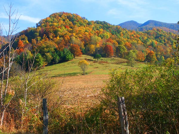